At Trayn, we want to deliver the best conditional training experience for both coaches and athletes. To assist athletes with their daily workflow using Trayn, we are preparing some big changes on mobile. The first thing we did was to completely rethink our user interface. Then we made plans for a lot of new features, that will make the lives of both athletes and coaches easier.
The problem with such a redesign is that the wrong approach often leads to the fact that it takes ages until all planned changes are implemented. We believe incremental updates are the best way to deliver big changes and this is why we release our changes one feature at a time.
Today, we released our mobile 2.0 update on both Android and iOS, which marks the beginning of a series of changes that are going to happen soon. We start with a refreshing look of our user interface. It is more modern and, more importantly, easier to use.
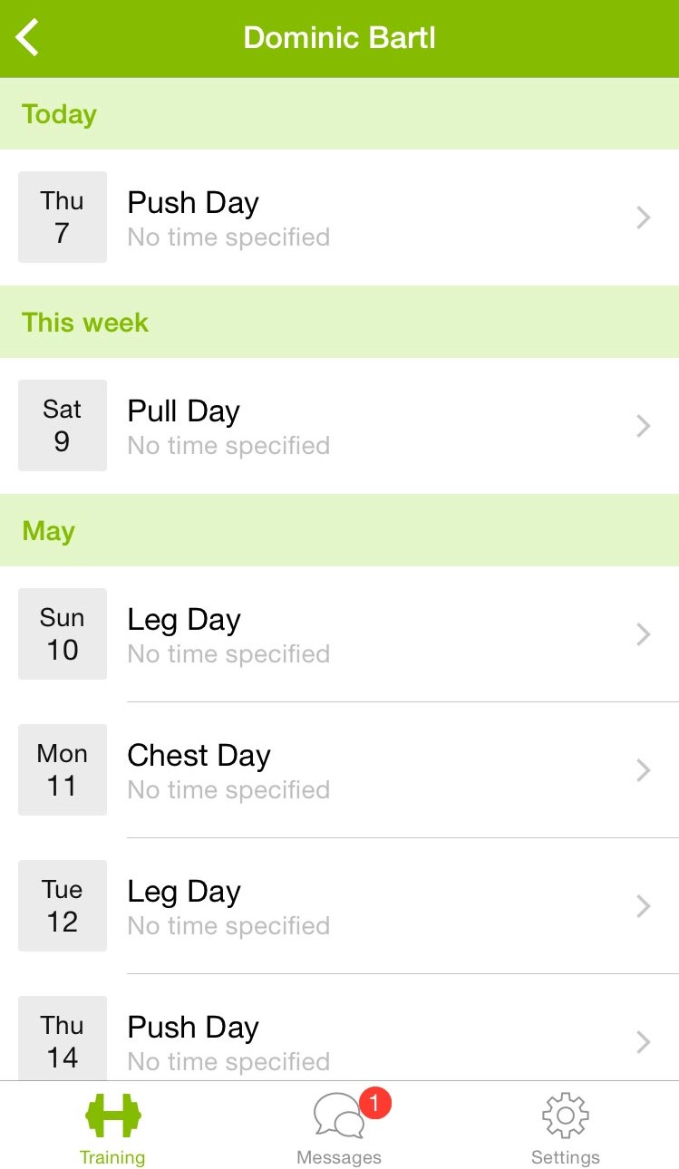
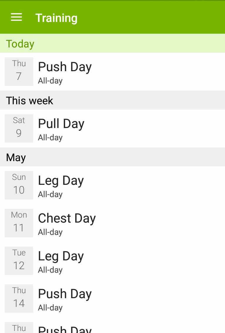
As you can see, on iOS (left) we chose to use a tab bar for faster navigation. On the iOS screenshot you will also notice that the athlete’s name is shown in the title. When logged in as a trainer, you can see all your athletes’ workouts and we show the athlete’s name in the title instead of just Training.
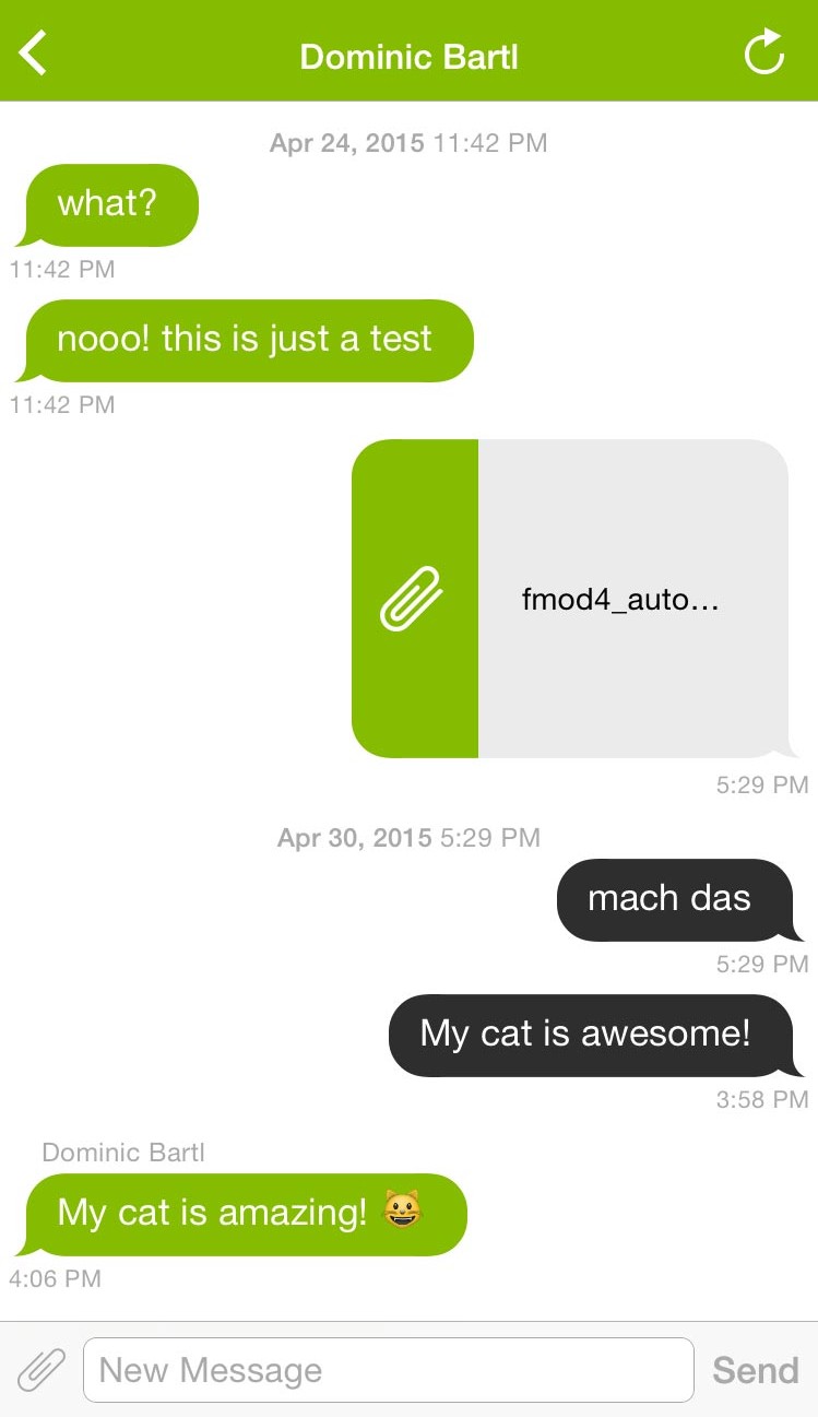
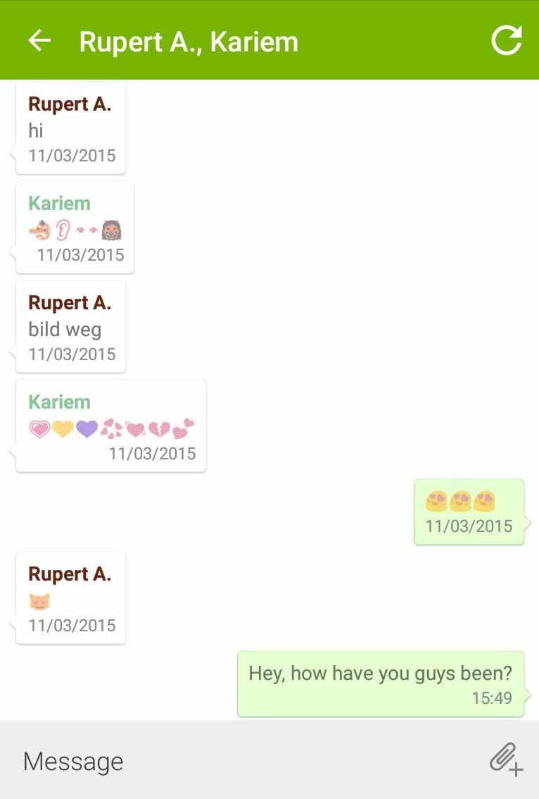
See more screens below; iOS left, Android right.
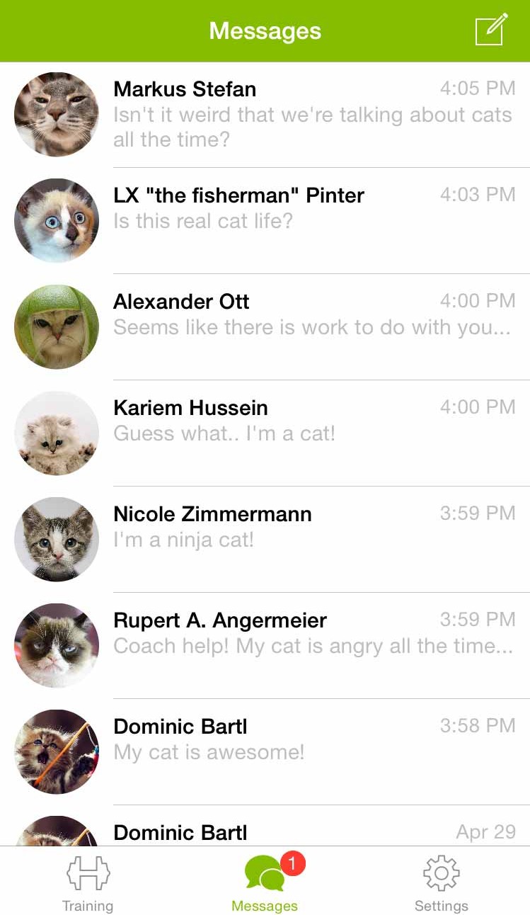
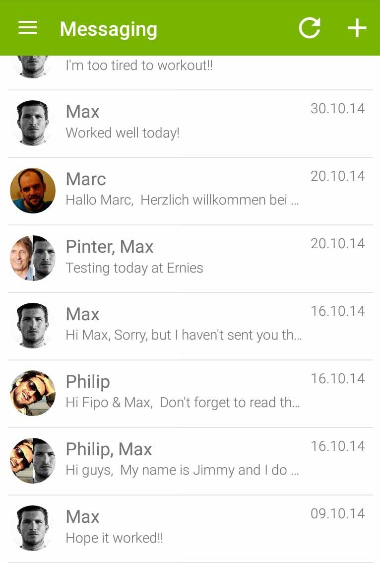
Stay tuned for all the upcoming updates!

